Birthday Colours and Fonts: What Actually Reads on a Screen
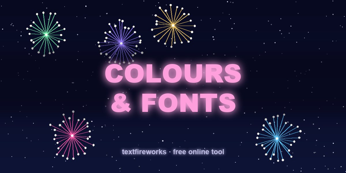
On a dark background, bright warm colours read best: gold, coral, hot pink and cyan. On a light background you need darker, more saturated versions of the same hues. The single biggest mistake is thin elegant type at small sizes — it disappears on a phone screen, which is where almost everyone will see it.
Every rule below is about one thing: whether the words survive being viewed on a six-inch screen, at arm's length, possibly outdoors. That is the real test, not how it looks on your laptop.
Why contrast decides everything
Text is readable when there is enough difference in lightness between the text and what is behind it — not enough difference in hue. Two colours can be completely different and still be unreadable together if they are the same brightness. Red text on a green background is the classic example: opposite hues, near-identical lightness, painful to read.
The practical version: squint at your design until it blurs. If the text disappears into the background, the contrast is too low, no matter how nice the colours are.
Palettes that work on dark backgrounds
Dark backgrounds are the default for fireworks, night-time video and most animated cards. Bright, warm, saturated colours carry best.
| Palette | Colours | Best for |
|---|---|---|
| Classic firework | Gold, warm white, coral red | Any birthday, any age |
| Neon party | Hot pink, cyan, lime | Teens, 18th, 21st |
| Sunset | Orange, coral, soft pink | Warm and affectionate |
| Elegant | Champagne gold, cream, deep rose | 40th, 50th, 60th |
| Kids | Yellow, turquoise, bright red | Under-tens |
| Single colour | One bright hue, nothing else | When the photo is the star |
Avoid deep blue, navy, purple and dark green as text colours on a dark background. They read as almost black at a distance.
Palettes that work on light backgrounds
Light backgrounds need the opposite: darker, deeper versions, or the text vanishes.
| Palette | Colours | Best for |
|---|---|---|
| Ink and coral | Near-black text, coral accent | Invitations, printed cards |
| Deep berry | Burgundy, plum, dusty rose | Elegant, adult |
| Forest | Deep green, warm gold accent | Garden and outdoor parties |
| Navy and gold | Navy text, gold accent | Formal milestones |
The font rules
Bold beats elegant on a screen. Thin and light weights lose their strokes when scaled down or compressed by a messaging app. If it is going onto a phone, use a heavy weight.
Script fonts are for two or three words maximum. A name in script looks beautiful. A whole sentence in script is unreadable and nobody will finish it.
Never use more than two typefaces. One for the name or the headline, one for everything else. Three is the point at which a design starts to look like a template.
All-caps works for short lines only. "HAPPY BIRTHDAY" in caps is fine. A full sentence in caps is measurably slower to read because the word shapes disappear.
Check the numbers before you commit. Some decorative fonts have terrible numerals, which matters enormously when you are setting a large "40" or "18".
Which fonts for which mood
| Mood | Typeface style | Examples of the style |
|---|---|---|
| Fun, loud, young | Heavy geometric sans | Poppins Bold, Montserrat ExtraBold |
| Elegant, formal | High-contrast serif | Playfair Display, Cormorant |
| Handwritten warmth | Casual script, used sparingly | Caveat, Dancing Script |
| Modern and clean | Neutral sans | Inter, Helvetica, system fonts |
| Playful, childlike | Rounded sans | Baloo, Nunito |
| Retro party | Condensed display | Bebas Neue, Anton |
Sizing for a phone screen
The name should be the largest thing on the design by a wide margin — roughly twice the size of everything else. Hierarchy is what makes a design readable in the half-second someone looks at it.
As a rough guide for a 1080-pixel-wide image: the main line at 90 to 130 pixels, the secondary line at 45 to 60, and anything smaller than 30 pixels will be illegible on a phone and should be cut rather than shrunk.
Leave breathing room at the edges. Around eight per cent of the width as a margin on every side. Text near the edge gets cropped by social platforms and covered by interface buttons in stories.
Two lines beat one
"Happy birthday Sarah" on a single line forces the type small to fit. Broken across two lines — "Happy Birthday" above, "Sarah" below and larger — the same message reads at twice the size in the same space.
This is the single easiest improvement to make to any birthday graphic, and it costs nothing.
Colours by age and occasion
Children under ten: primary colours, high saturation, no subtlety. Yellow, red, turquoise, bright green.
Teenagers and 18th/21st: neon on black. Hot pink, cyan, lime, purple. The look should feel like a night out.
Thirties and forties: one accent colour against a neutral. Restraint reads as expensive.
Fifty and above: metallics and deep jewel tones. Champagne gold, burgundy, deep emerald.
Anything for a partner: warm palette, low colour count. Two colours plus white.
The mistakes that come up most
Gradient text on a gradient background. Both move, so the contrast changes across the letters and part of the word always disappears.
A drop shadow used to fix bad contrast. If the text needs a shadow to be legible, the underlying colours are wrong. Fix the colours.
A photo behind text with no darkening layer. Photos have bright and dark areas, so text over them is readable in some places and not others. Add a semi-transparent dark layer over the photo first.
Pure red on pure black. Almost identical in lightness. Use coral or orange-red instead.
Too many colours. Three is a palette. Six is a mess. If you cannot decide, use one colour and vary the brightness.
The fastest way to get it right
Pick a dark background, one bright warm colour for the name, and white for everything else. That combination is almost impossible to get wrong, works at every size, and survives compression by every messaging app.
If you want to skip the decisions entirely, an animated card with the name already set in a tested palette takes about a minute and removes every problem on this page.
Common questions
What colours are best for a birthday card? On a dark background, gold, coral and hot pink. On a light background, deep berry, navy or near-black text with a single bright accent.
What font should I use for happy birthday? A heavy sans-serif for the words and, if you want decoration, a script for the name only. Bold weights survive phone screens; thin ones do not.
Why does my text disappear in the video? Almost always contrast. The text colour and the background are similar in lightness even if the hues are different. Make the text much brighter or much darker than what is behind it.
How big should the name be? About twice the size of everything else on the design. If the name is not obviously the biggest element, the hierarchy is wrong.
Can I use a photo as the background for text? Yes, but put a semi-transparent dark layer between the photo and the text. Without it, the text will be readable over some parts of the photo and invisible over others.
How many colours should a birthday design use? Three at most, including white. One background, one accent, one text colour.